
How your Side Hustle presents itself to the outside world.
Although your Side Hustle’s Purpose, Mission, Vision, Values and Culture are integral to shaping its identity, the identity itself creates a consistent and clear visual identity for your Side Hustle. You’ll see examples of your Side Hustle’s identity on everything from social media posts to billboard ads, staff uniforms, company stationery, product packaging, app profiles, the list just goes on.
Essentially, any communication or information you see when you or your customers interact with your Side Hustle is part of its identity.
With the strong foundation in place of having team alignment on your Side Hustle’s purpose, mission, vision, values and culture. You can get to work with your design team or a corporate identity design company on creating a visual language that conveys the professionality and reliability of your Side Hustle.
Here are the 5 elements to focus on when designing your Side Hustle’s identity.
1. Logo
There’s more to a great logo than meets the eye. Sure, a logo needs to be immediately recognizable and convey the essence of a brand. But the best logos are also clever, memorable and perfectly suited to the company they represent. To understand how to create a truly great logo, it helps to know the different types of logos.
Here’s a quick rundown of the most common logo types:
Lettermarks: Lettermarks are logos that consist of one or more letters, often initials. They’re simple, straightforward and easy to remember. Examples include Hewlett-Packard, H & M and KFC.
Brandmarks: Brandmarks are logos that feature an abstract or pictorial symbol. They’re often more complex than lettermarks, but can be just as memorable. Think Apple, Nike and Adidas.
Wordmarks: Wordmarks are logos that feature the company name in a stylized font. They’re great for companies with long, difficult-to-pronounce names. Google and Hershey’s are two well-known examples.
Combinations: As the name suggests, combination logos are a mix of two or more of the above logo types. The most common combination is a wordmark with a brandmark, but there are endless possibilities. Burger King and Taco Bell are two examples of companies with combination logos.
So, what makes a great logo? It all comes down to three things: simplicity, memorability and relevancy. A great logo is simple enough to be immediately recognizable, but complex enough to be interesting. It’s memorable, so it sticks in people’s minds. And it’s relevant, so it perfectly conveys the brand it represents. With that in mind, here are four tips for creating a great logo:
1. Keep it simple. The best logos are often the simplest. A complex logo may be difficult to remember and hard to reproduce. When in doubt, less is more.
2. Make it memorable. A great logo should be easy to remember. That means it should be distinctive, so it stands out from the competition.
3. Keep it relevant. A logo should perfectly convey the brand it represents. That means it should be appropriate for the company’s target audience and reflect the company’s values.
4. Make it versatile. A great logo should be versatile enough to work in a variety of contexts. That means it should look just as good on a business card as it does on a billboard.
2. Typeface
There are 6 basic typefaces that play a role in your brands identity.
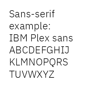

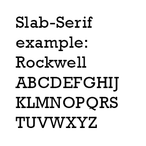
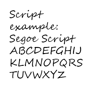
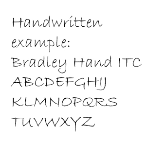
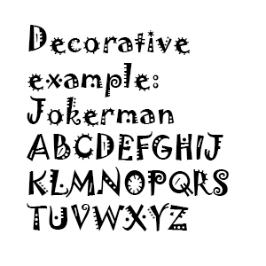
Each typeface has its own unique style that can help to communicate the personality of your brand. For example, a serif typeface is traditional and classic, while a sans serif typeface is more modern and clean.
The typefaces you choose for your brand should be carefully selected to reflect the overall tone and style of your business. Your choice of typeface can make a big impact on how your brand is perceived by customers and prospects.
When used correctly, the right typefaces can help to reinforce your brand identity and make a lasting impression on your audience.
3. Color Palette
First impressions are important, and the colors you choose for your brand can say a lot about who you are and what you stand for. A well-chosen color palette can communicate your brand’s personality and set you apart from the competition.
Your color palette is an important part of your brand’s identity. It can influence how customers feel about your brand, and it can be a powerful tool for differentiating your business from others in your industry.
When choosing colors for your brand, consider what each color represents and how it might be perceived by your target audience. You can use a color wheel to help you find complementary colors that work well together.
Think about how you want your customers to feel when they see your brand. Do you want them to feel energized and excited? Or calm and relaxed? The colors you choose can help convey these emotions.
Your color palette can also say a lot about your brand’s personality. If you want your brand to be seen as fun and approachable, you might choose brighter, more playful colors. If you want to communicate a more sophisticated brand personality, you might choose a palette with darker, richer colors.
No matter what colors you choose, make sure they are consistent across all of your marketing materials. This will help customers easily recognize your brand, and it will make your marketing more effective.
4. Tone Of Voice
Tone of voice is essential to any brand’s identity. It is the way the brand speaks to its audience, and it can communicate a lot about the brand’s values and personality. A strong tone of voice can help a brand to stand out from its competitors, and it can make a lasting impression on customers.
A brand’s tone of voice should be consistent across all of its communications, from its website and social media posts to its advertising and marketing materials. It should be reflective of the brand’s overall identity, and it should be used to reinforce the brand’s key messages.
The tone of voice a brand uses can have a big impact on the way it is perceived by its audience. A friendly, approachable tone of voice can make a brand seem more approachable and relatable, while a more formal tone of voice can make a brand seem more premium and exclusive.
The tone of voice a brand uses should be appropriate for its target audience. A brand that is targeting young adults, for example, will likely use a different tone of voice than a brand that is targeting seniors.
Tone of voice is an important consideration for any brand that wants to create a strong, consistent identity. It can be used to communicate a lot about the brand, and it can help to make a lasting impression on customers.
5. Imagery
Imagery is one of the most important aspects of a brand’s identity. It is the visual representation of who the brand is and what it stands for. The right imagery can communicate a brand’s message and values to its audience, and help to build a strong and recognizable identity.
When choosing imagery for a brand, it is important to consider what the brand represents and what kind of message it wants to communicate. The images should be recognizable and memorable, and should convey the essence of the brand.
The right imagery can be a powerful tool in building a strong and recognizable brand identity. It can help to communicate the brand’s message and values, and to connect with its audience.
